|
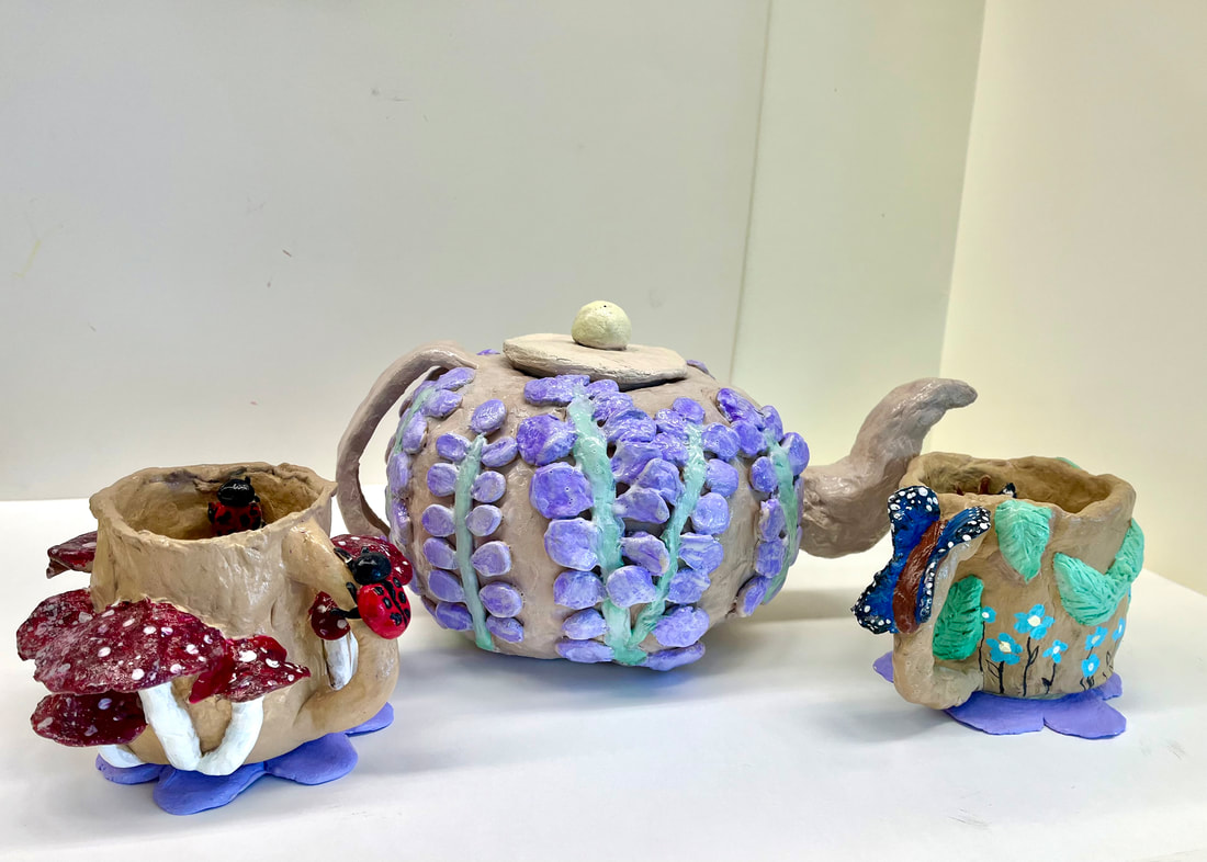
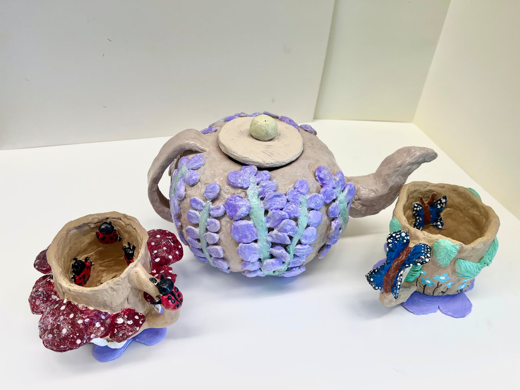
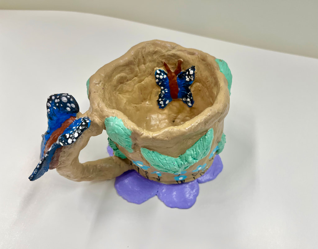
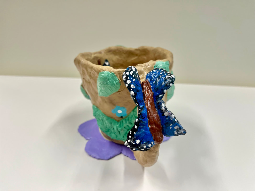
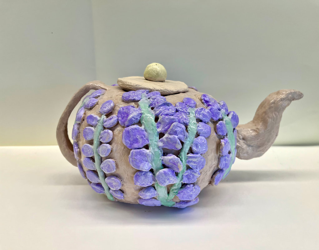
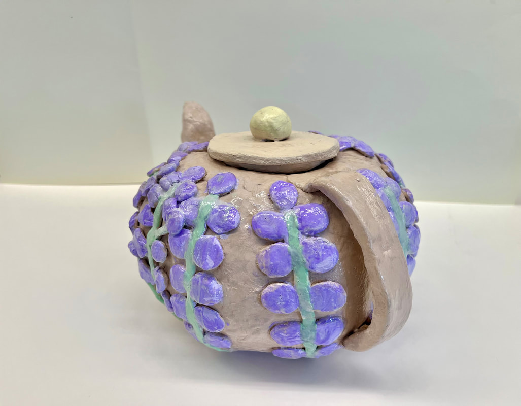
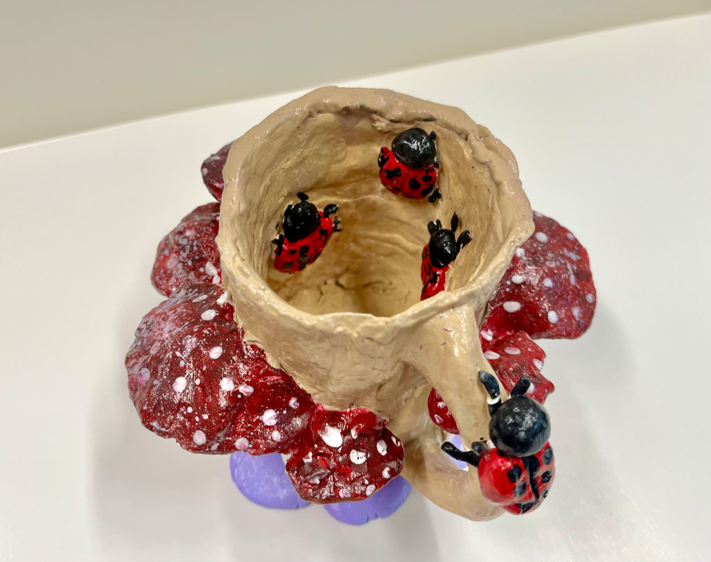
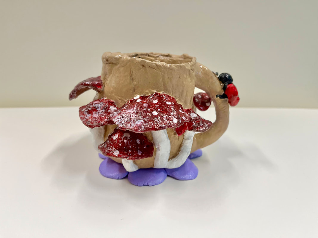
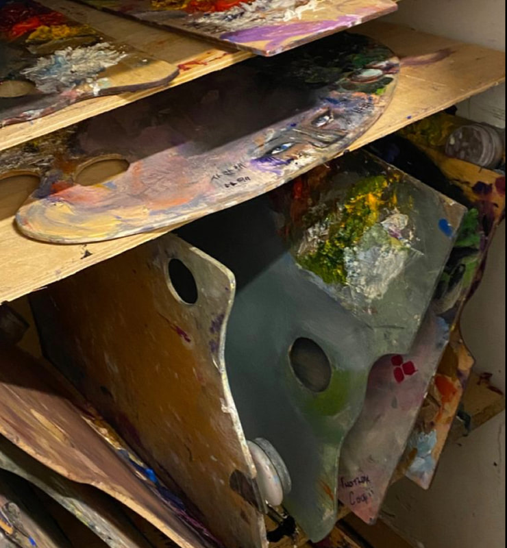
When it comes to creating truly captivating pieces of art, it's essential to understand the principles of art. Whether you're working with color, form, space, or texture, these principles can help guide your decisions and make your artwork more impactful. Some of the key principles of art include balance, contrast, emphasis, movement, pattern, rhythm, and unity. By understanding how these principles work together, you can create artwork that's not only aesthetically pleasing but also communicates a message or emotion. One artist who has mastered the principles of art is Frank Stella. Known for his innovative use of color, form, and shape, Stella has created some of the most mesmerizing pieces of art in recent history. His insect-like designs, for example, are a testament to his mastery of form and space, as he creates intricate shapes and patterns that seem to defy gravity. By using bold colors and strong contrasts, he's able to make these designs pop and draw the viewer's eye. Overall, Stella's artwork is a testament to the power of the principles of art and how they can be used to create truly breathtaking pieces. I collaborated with Skylar Klain and Hailey McDonough to create a coffee set that incorporated insects and flowers, inspired by the principles of art and Frank Stella. It was a challenging but thrilling experience. We began by sketching out our ideas and after some disagreements, settled on a design featuring mushrooms and ladybugs on one cup, and butterflies and leaves on the other. The coffee pot was adorned with beautiful lavender flowers, meticulously crafted. During our coffee set-making project, we decided to start by using clay and plastic cups. We knew that it was important to be very careful as we worked on the clay, so we took our time smoothing it out to make sure that it was just right. We didn't want any bumps or rough spots that could make the cups uncomfortable to hold or use. Once we had the clay cups shaped and smoothed to perfection, we moved on to creating the coffee pot. For this, we decided to use a plastic pumpkin that we found throughout our art class! It was a bit of a challenge to carve the pumpkin, as it wasn't hollow like we had expected it to be. But we were determined to make it work, so we spent an entire class period carefully carving out the shape of the coffee pot. It was a slow and steady process, but we were pleased with the results. The coffee pot came out looking just as we had hoped it would - sleek and modern with a unique twist. We were proud of our hard work and dedication to the project, and couldn't wait to show off our creations to our classmates and teachers. Overall, the coffee set-making project was a great success. We learned a lot about working with different materials, the importance of taking our time to get things just right, and the satisfaction that comes with creating something from scratch. It was a fun and challenging project that we will always remember, and we're grateful for the opportunity to have worked on it together as a team.
0 Comments
 Roy Lichtenstein and all of his works were introduced to my class and me through this art project with Ms. Schaetzle. American pop artist Roy Fox Lichtenstein worked alongside artists including Andy Warhol, Jasper Johns, and James Rosenquist in the 1960s. Liechtenstein, however, was a leader in the new art trend. His work stood out and, through parody, defined the tenet of pop art. For instance, Roy's dots and lines in all of his artwork were extremely exact. He applied a variety of stencils to his work, giving it the appearance and feel of commercial printing processes. Also, he made extensive use of vivid colors, bold edges, and Benday dots. In doing so, he transformed comic book and advertisement imagery into fine art.
I produced my own work of pop art using Roy Lichtenstein's artwork as a reference. In my work of art, Betty Boop is surrounded by hearts and her name is written in bold lettering. While browsing Pinterest, I had this thought. I had to start painting as soon as I found this stunning piece of Betty Boop Pop art. In addition to finding inspiration in other people's artwork, I knew my grandma adored Betty Boop and thought it would be fun to recreate her in my painting. In my art, there are a lot of different hues which are brought together in my artwork. I used Benday Dots throughout the hearts in the art piece and had precise lines with Betty Boop herself, and her dress. Outlining the main parts of my art with a small black pen brought it together. In the end, I really did have a successful painting. My artwork came to life with Betty Boop's precise linework and vibrant colors. I had a great time learning about Roy Lichtenstein and painting in this style. One of my favorite classes, where I can be myself with my artwork, is Ms. Schaetzle's. This project was fun for me to make, and I intend to continue creating masterpieces.  For this art project with Ms.Schaetzle, we continue learning and finding different ways to incorporate the elements of art in our art pieces. In order to get inspired for this project, we started by looking at various artworks and artists. The still-life painting "The Basket of Fruit" by Caravaggio served as my source of inspiration. Italian painter, Caravaggio, lived and worked in Rome. He spent his final years traveling the world and producing priceless artwork. His entire body of work is a masterpiece. Yet, this still-life painting that spoke to me through its value, color, and placement is by far my favorite piece of him.
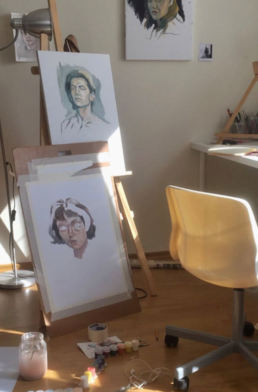
I attempted to replicate this in my art project by drawing a grid line to ensure that all of the fruits and the basket itself were placed correctly. I was also able to add detail and have clean lines in my piece because of the grid line. The grid line also assists in establishing the midground, foreground, and background as this is a still-life project. While my background is empty, the objects in my front and middle ground give my still life some life. With its smoothness and gentle, light-colored strokes in shades of white, yellow, and brown, my foreground captures the basket itself. I also highlighted the value of the various fruits in the mid-ground using pastel hues. Particularly in the apple and all over the grapes with purple skin. Ms. Schaetzle gave me advice on how to make the grapes appear more three-dimensional than two-dimensional. I really brought my creativity to life when I listened to her and took this advice. As we continued this lesson, we were studying several painters. Goethe was one artist who particularly stood out to me. Johann Wolfgang von Goethe developed a hypothesis on how color affects our emotions. He takes into account how color's potent psychological impact on the spiritual experience of art. We young artists are aware of the significance that color has on art. With that being said, I took it into consideration and incorporated it into my artwork by choosing warm, brown tones. It was a little challenging to blend the pastels, but with a little more effort, it came together. One of my favorite projects I've ever done was this art piece. It's also the largest piece of art I've ever done. I can say that I performed a decent job and plan to continue doing so with the help of inspiration from other artists and learning about and understanding the elements of art. Project #1 : Introduction to The Elements of Art - Getting to know yourself– Student Self Portrait1/27/2023  As we switch our classes this semester, I am ecstatic to begin my class with Ms.Schaetzle. Our first project of the brand-new semester is a student self-portrait. When seeing this assignment I can assure you that I was excited to start working. In this project, I learned the elements of art, and how there’s so much more than just lines and shapes. For starters, this project allows me to have one side with realism and the other side with my hobbies and characteristics. With that being said, on the right side of my project, we see the realism side. We see shapes that create my facial features, and value to make them come alive. When looking past my facial features, the hair contains a texture that represents my curly hair. Then, when you look to the left side at my characteristics and hobbies we can see elements such as color and spacing. When using these elements correctly, helps my project become even better. In this art piece, the small details are what make it.
Going off of this, this assignment was something that is supposed to be personal to us, by adding small details that make us into the young individual we are. For instance, we see both the Puerto Rican, and Colombian flags. These both represent my ethnicity and where I am from. Being Puerto Rican and Colombian is one of my favorite things about myself. I love being a part of this culture, and to see the countries themselves is beautiful. I am forever proud of my origins, and still to this day learn more and more about them. We also see a softball and a softball bat. I added both of these items because I am very passionate about playing softball. Without it in my life, I would be completely and utterly a different person. The sport itself has brought me many lessons, and many bonds that I will have forever. Because of this, I added the “P” because it is known as the Pirates logo. The Pirates is an organization I play for. The girls I have met, and the coaches have brought me so much joy and created more love for the game. I then added the #7, not only because it is my softball number, but because it is my lucky number. The angel number 777 means "The path ahead can become challenging, but the message is to keep a positive outlook to overcome anything." So, whenever I see the number 7, or 777 I am always reminded of this quote to stay positive throughout any obstacle. I also added a butterfly with a semicolon. Butterflies are frequently used to represent natural development and metamorphosis, beginning as a caterpillar and evolving into vivid, colorful bugs with the ability and freedom to fly. This demonstrates that we may always adapt and progress into something better. An example of this is me taking these small things and making them a reality is my goal to become a nurse. My mom is someone who is a great role model to me. Seeing her be an Ultrasound Technician inspires me every day to help those around me. I understand that nursing is more bedside manner, so I strive to become a nurse and be there to help those in need. In my drawing, I have the symbol for nursing, next to my heart for my family. I did this specifically because my family inspires me every day and supports me in my dreams. I hope to make them proud by accomplishing these dreams and making them a reality. Another small heart we see, next to the butterfly, is a heart for my friends. I did that purposely because my friends always allow me to grow. They always tell me when I’m in the wrong and are always there for me when I need them. They truly are very important to me, and I hope to keep them in my life forever. Lastly, the last few items on my creation are the star for the Dallas Cowboys, and the logo for New York Yankees. I truly am die-hard for both of these teams. Win or lose I will always represent! My favorite thing about watching these games is being able to watch them with my dad. It’s so much fun yelling at our TVs or talking about the game. I also have earbuds on my drawing because I love listening to music. It’s truly an escape from the real world, and I have over 5,000 hours on my Spotify. In conclusion, this art project was fun to make. I hope to see something as exciting, or even more exciting when continuing to take this course. |